The Technicolor Challenge
In some ways Technicolor solves the grayscale problem, in which different colors will render indistinguishable in black and white. On the other hand, it poses its own challenge, since background color, even out of focus, could compete for the specatator's attention with the foreground.
Also, famously, Technicolor required high key lighting and limited the dynamic range between highlight and shadow. The difference between two Shamroy musicals, Lillian Russell and That Night in Rio, is striking:

I would recommend Scott Higgins' terrific book Harnassing the Technicolor Rainbow for an account of the challenges Technicolor presented and the ways Hollywood cinematographers adapted their practice to color. He argues that after an initial showcasing approach to color, two alternatives developed: a restrained style downplaying hue in favor of variations in saturation and intensity and an expanded palette selectively varying hue in complementary fashion.
Leon Shamroy's Technicolor work both confirms and complicates this account. In fact, Higgins uses to Shamroy films, The Black Swan and Night in Rio, to exemplify the expanded palette and the mixed restrained-expanded approach, respectively. What I find interesting, though, is that of the three Shamroy Technicolor films I have watched (plus Wilson, but it has been many years since I have seen that one and I do not yet have a good copy of it to reexamine), there is a historical progression of Shamroy's adoption of his black and white aesthetic to Technicolor.
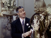
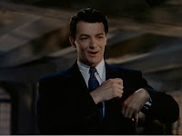
That Night in Rio is the least distinctive. For those looking there are still telltale signs of Shamroy lighting set ups (more to come on that), but by and large images like the above do not appear that different from a high-key MGM style of Charles Rosher, say. Also, in trying to create some hint of sculptural lighting effects, the light requirements seem to cast unwanted shadows. I have to imagine this setup for instance would have been seen as sloppy in a black-and-white film:
 In order to pool extra highlight on Ameche's face, Shamroy has to settle for a top-hat double of a shadow. And even when he goes for his most typical glamorizing lighting (heavy kicker, spotlighting)...

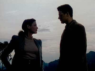
...the high-key requirements wash out Alice Fay's face, flattening it at least in comparison to the black and white counterpart:

In the Black Swan, perhaps given more leeway for "effects lighting" by the swashbuckler genre, Shamroy employs far more of the expressive lighting and patterned shadows that his black-and-white features trade in. Many of the instances, too, use a common warm-cool color contrast, but amplify an unusual orange and blue-green palette, giving it almost the effect of two-strip Technicolor:


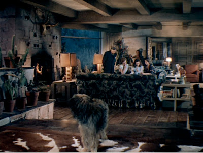
These effects lighting moments are at least minimally motivated (reflecting water, lamplight, etc.) and are reserved for nighttime. The film's daylight scenes are more typical of the high-key expanded palette approach that Higgins outlines (using Robin Hood as an example). What is distinctively a Shamroy touch, though, is the individuation of lighting within crowd shots, particularly in the assembly scenes. (This would develop more in Wilson).
 This shot may look like a typical high-key Technicolor shot, but what distinguished from say an MGM shot is its use of overlighting to make each character sculpted, even with the intensely bright set. Note, too, the shadows on the background set in the top half of the frame.
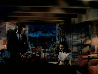
Leave Her to Heaven plays up effects lighting to extreme, pushing it into the realm of atmospheric lighting. As in Black Swan, Leave Her to Heaven relies heavily on the orange-green contrast, but does not require motivation for it:
 Interiors extend this contrast across a dizzying assortment of shadow combinations:
One early scene shows these not as static, expressionist effects, but rather part of a sustained Shamroy aesthetic:

In establishing and reestablishing shots (1, 4 above) the multiple lights and their shadows create a three-dimensionality and emphasize the low ceilings and "homey" decor. In Shots 2, 3, the shadows help distinguish the actors from the background. Additionally, partial spotlights sculpt the actors faces and figures. In short, the scene is lit much like a black and white Shamroy film, only with the additional element of color added and less use of overexposure.
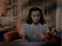
Still, Shamroy does play around with exposure. Leave Her to Heaven is surprisingly underexposed at points, both notably in the funereal scene...
and in some interior scenes, such as the dinner scene in which candlelight creates a glare reflected in the glass:

Leave Her to Heaven signals that the distinction between restraint and expressionistic color does not apply to Shamroy, for whom the fully sculpted style comes only as he uses color in more expressionistic ways. This paradox gets at the contours of a style I call mannerist, but that's a post for another day.
Also, famously, Technicolor required high key lighting and limited the dynamic range between highlight and shadow. The difference between two Shamroy musicals, Lillian Russell and That Night in Rio, is striking:


I would recommend Scott Higgins' terrific book Harnassing the Technicolor Rainbow for an account of the challenges Technicolor presented and the ways Hollywood cinematographers adapted their practice to color. He argues that after an initial showcasing approach to color, two alternatives developed: a restrained style downplaying hue in favor of variations in saturation and intensity and an expanded palette selectively varying hue in complementary fashion.
Leon Shamroy's Technicolor work both confirms and complicates this account. In fact, Higgins uses to Shamroy films, The Black Swan and Night in Rio, to exemplify the expanded palette and the mixed restrained-expanded approach, respectively. What I find interesting, though, is that of the three Shamroy Technicolor films I have watched (plus Wilson, but it has been many years since I have seen that one and I do not yet have a good copy of it to reexamine), there is a historical progression of Shamroy's adoption of his black and white aesthetic to Technicolor.
That Night in Rio is the least distinctive. For those looking there are still telltale signs of Shamroy lighting set ups (more to come on that), but by and large images like the above do not appear that different from a high-key MGM style of Charles Rosher, say. Also, in trying to create some hint of sculptural lighting effects, the light requirements seem to cast unwanted shadows. I have to imagine this setup for instance would have been seen as sloppy in a black-and-white film:
 In order to pool extra highlight on Ameche's face, Shamroy has to settle for a top-hat double of a shadow. And even when he goes for his most typical glamorizing lighting (heavy kicker, spotlighting)...
...the high-key requirements wash out Alice Fay's face, flattening it at least in comparison to the black and white counterpart:

In the Black Swan, perhaps given more leeway for "effects lighting" by the swashbuckler genre, Shamroy employs far more of the expressive lighting and patterned shadows that his black-and-white features trade in. Many of the instances, too, use a common warm-cool color contrast, but amplify an unusual orange and blue-green palette, giving it almost the effect of two-strip Technicolor:


These effects lighting moments are at least minimally motivated (reflecting water, lamplight, etc.) and are reserved for nighttime. The film's daylight scenes are more typical of the high-key expanded palette approach that Higgins outlines (using Robin Hood as an example). What is distinctively a Shamroy touch, though, is the individuation of lighting within crowd shots, particularly in the assembly scenes. (This would develop more in Wilson).
 This shot may look like a typical high-key Technicolor shot, but what distinguished from say an MGM shot is its use of overlighting to make each character sculpted, even with the intensely bright set. Note, too, the shadows on the background set in the top half of the frame.
Leave Her to Heaven plays up effects lighting to extreme, pushing it into the realm of atmospheric lighting. As in Black Swan, Leave Her to Heaven relies heavily on the orange-green contrast, but does not require motivation for it:
 Interiors extend this contrast across a dizzying assortment of shadow combinations:
One early scene shows these not as static, expressionist effects, but rather part of a sustained Shamroy aesthetic:


In establishing and reestablishing shots (1, 4 above) the multiple lights and their shadows create a three-dimensionality and emphasize the low ceilings and "homey" decor. In Shots 2, 3, the shadows help distinguish the actors from the background. Additionally, partial spotlights sculpt the actors faces and figures. In short, the scene is lit much like a black and white Shamroy film, only with the additional element of color added and less use of overexposure.
Still, Shamroy does play around with exposure. Leave Her to Heaven is surprisingly underexposed at points, both notably in the funereal scene...

and in some interior scenes, such as the dinner scene in which candlelight creates a glare reflected in the glass:

Leave Her to Heaven signals that the distinction between restraint and expressionistic color does not apply to Shamroy, for whom the fully sculpted style comes only as he uses color in more expressionistic ways. This paradox gets at the contours of a style I call mannerist, but that's a post for another day.

Comments
Thanks for the nod, and for the excellent discussion of Shamroy. Leave her to Heaven is a remarkable film for pushing the mixture of color temperatures (warm lamplight, blue moonlight) for architectural and expressive ends. He builds on the growing acceptance of this color temperature mix during the 1940s to stylize the image. As you note, The Black Swan also features this experimentation, and DVD doesn’t quite capture it. Heaven, in reaching toward a sort of color-noir melodrama is also, I think, a vital influence on Russell Metty’s work in All that Heaven Allows.
I am also interested to see you use MGM film as a foil for Shamroy’s Fox work. I have always, perhaps unfairly, thought of the Fox musicals as fairly pedestrian in color design and lighting (The Gang’s All Here is a different story). On the other hand, I find Folsey’s work on Meet me in St. Louis hard to beat. But even Rosher’s color work on Yolanda and the Thief and The Yearling is pretty complex. Your notes on Shamroy really make me want to give the Fox films a closer look. Great Stuff.
Scott Higgins, Associate Professor of Film Studies, Wesleyan University
I had tossed out Rosher's name and MGM not as a bad object but because in my mind they reflect a high key approach, though after your comments I'm realizing that I'm perhaps thinking more On an Island with You than The Yearling. In any case, I look forward to examining Rosher's (and Folsey's) work more closely as I make my way through the major cinematographers of the 40s.